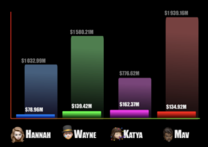
From Mav: I love charts. I fucking love charts! Am I alone here? I’m a nerd, when I was a kid, I used to play with this computer program called Harvard Graphics, just for fun. All it did was make charts. Last week, working on the final chapter of my dissertation, I got to a point where I needed to explain the decline in marriage rate vs an increase in women in the workplace over the 20th century and I got excited because “OMG! I get to use a chart here!!!” Then, just yesterday, I was putting together the YouTube version of this week’s VoxPopcast episode when my wife Stephanie walked by and says “wow! Is that an animated chart? Awesome!” (and it is… if you haven’t watched the YouTube version of the episode, you should… at least watch from 2:25-5:40 and hit the like and subscribe buttons and ring the bell and whatever the youtube things are). Anyway, she was impressed because she loves charts. I love charts. We all love charts. Because charts fucking rock!
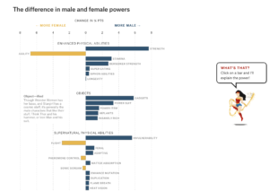
In another life, I used to work as a professional designer. I used to work for a place called MAYA Design, which was famous for our data visualization. As such, I spent a lot of time making a lot of charts for a lot of specific business needs. So it maybe makes sense that I love them so much. If you’re trying to track financial gains and losses over time or deployments of troops in war zones, data visualization is super useful. But I’ve been noticing an upward trend in chart use in other areas. Digital Humanities peeps love them! One of the first things that I wanted to talk about when we started this show was an article by Amanda Shendruk that analyzed superheroes via gendered powers and names. I’ve also noticed a lot of excitement whenever (friend of the show) Andrew Deman of The Claremont Run posts analytic data as charts on the project’s twitter feed. And there’s a book that I love called Super Graphic by Tim Leong which is pretty much just a random collection of charts detailing different things from comic book superhero history.
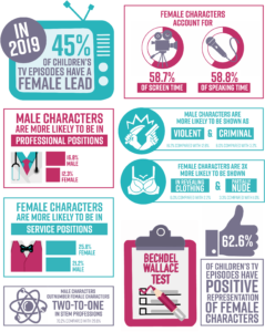
The way Shendruk, Deman, and Leong use data visualization made me think a bit about the way we mix concrete quantitative analytic data to talk about qualitative literary issues. The clearest one I can think of is gender representation. I’ve seen a ton of charts that detail Bechdel test representation. I’ve seen the same with age and race issues. Of course one of the biggest problems with quantitative research is that it misses nuance. For instance, movies like Gravity and Little Mermaid. The former absolutely fails the Bechdel test, despite clearly being intended as a feminist narrative, because there’s only one character for the majority of the film and thus necessarily no female conversation. The latter usually scores very low when people count the number of spoken lines female characters have in a film, because she’s mute for half of her movie, despite being in nearly every scene (as opposed to Snow White or Sleeping Beauty who are comatose for large portions of their films). That’s not to say that these isssues aren’t important; they are. More that when places like the Geena Davis Institute on Gender in Media reduce the complex issue to a chart, it gets eyeballs on it, but a lot of the nuance of the data is lost.
I do think it has its purpose and its benefits. USAToday became a famous newspaper mostly because of its charts. I see about a billion memes a day that are basically just Venn diagrams. Really, much like our news by meme episode, people don’t like to read so they like a good chart that gives them some information and they can move on. On the other hand, I’m a follower of the Edward Tufte school of data visualization. I believe imagery (be it in a document, website, or Powerpoint presentation) should ADD to the text content, not replace or replicate it. The chart should always be designed to provide the clearest and most accurate representation of the data that you can without disrupting people’s understanding of the content, and content should stand on its own without the chart. But I realize not everyone feels this way. People love a good pie chart and it’s pretty much never the best way to present any data ever.
So what makes a good chart? Do they add to content or distract from them? Do you pay attention to the articles they accompany or do you just read the chart and move on? What do you think about when you use them yourself? Let us know any thoughts you have about charts in the comments below.

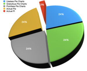





@chrismaverick Is that an iWork pie chart?
Is that an iWork pie chart?
That it is.